Neo Deco Keeps Art Deco's Lines and Throws Away Its Contrast
The 2026 Art Deco revival works by keeping Deco's geometric grammar — symmetry, fluting, sunbursts, stepped forms — while swapping its high-contrast black-and-chrome palette for warm, matte, low-contrast grounds.
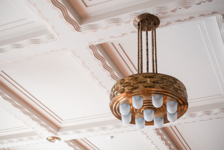
The line survived; the palette did not
Art Deco turned one hundred in 2025, and instead of retiring to the archive it came back wearing different clothes. Pinterest named Neo Deco a headline forecast for 2026, Houzz flagged an Art Deco return, and on 1stDibs the demand data was blunt: searches for Deco pieces spiked around ninety-nine percent in a single quarter, with chandeliers pushing into the most-searched lighting of the year. What is strange about the revival is what it kept and what it quietly threw away. The geometry came back almost untouched. The look, somehow, is the opposite of the 1920s.
The reason that is possible, and the real point of this piece, is that Art Deco was never a mood. It was a grammar. And a grammar can be spoken in a completely different tone of voice.
Deco was a set of rules, not a feeling
Strip the glamour away and the original style is a small, strict kit of geometric moves. Bilateral symmetry, first of all — compositions balanced left against right with almost architectural discipline. Then the radial sunburst or sunrise, a defined circle throwing out tapered, stepped or fluted rays. The stepped ziggurat and the pyramid profile, borrowed from Babylon, Egypt and Aztec Mexico, which is why so many Deco mirrors and cabinets climb in tiers. The chevron and the zigzag, often stacked into that same tiered geometry. Fluting and reeding, the parallel vertical grooves that turn a plain column or drawer front into rhythm.
Onto that skeleton the 1920s bolted a particular material story: lacquer, chrome, ivory, polished stone, exotic inlaid wood. High shine, and above all high contrast — black against ivory, chrome against dark lacquer. It was the machine age announcing itself, and the announcement was loud.
Here is the useful separation. The symmetry, the sunburst, the ziggurat and the fluting are the grammar. The gloss and the black-and-ivory contrast are the tone of voice. Almost everything that dates the original, that makes a faithful 1920s room read as a stage set, lives in the tone, not the grammar.
The livability was hiding in the contrast
That separation is the whole mechanism of Neo Deco. The revival keeps the grammar and rewrites the tone.
Consider what actually makes a high-Deco room feel theatrical rather than restful. It is not the sunburst mirror or the fluted panel in themselves; it is that they were staged in maximum tonal contrast and maximum reflectivity. A black lacquer chevron against ivory is a hard edge the eye cannot help reading as a boundary. Multiply those edges across a room and the space vibrates — impressive, but never calm. Sheen makes it worse, because gloss adds a second, moving layer of highlights on top of the pattern.
Lower the contrast and kill the gloss, and something quietly flips. The same fluted panel, now in warm oak or a matte chocolate plaster, still carries its vertical rhythm — the parallel grooves the eye reads fluently as ordered repetition — but the rhythm no longer shouts, because there is no black-on-white edge driving it. The sunburst becomes a soft radial texture instead of a spotlight. Symmetry reads as steadiness rather than spectacle. The geometry does the same perceptual work; it simply stops competing with the palette for attention. The livability designers claim for Neo Deco is not a vague softening. It is a measurable move: keep the lines, collapse the contrast ratio, and trade sheen for texture.
The 2026 move is a palette swap and a finish swap
This is exactly what the trend forecasts describe, once you read past the styling language. The single biggest change from Art Deco to Neo Deco is the colour. Out go the saturated jewel tones — the ruby and sapphire of the original — and in come deeper, lower-key grounds: burgundy, chocolate brown, midnight navy, muted amethyst and emerald. Chocolate brown in particular has become the season's anchor neutral, named by 1stDibs designers alongside warm metals and vintage forms.
The finish story runs parallel. Chrome and mirror-lacquer give way to antique brass, smoked rather than clear mirror, honed marble and travertine, velvet, and hand-worked wood. Note that these are all lower-contrast, lower-gloss substitutes for their 1920s equivalents: smoked mirror for bright mirror, antique brass for chrome, velvet for lacquer. The forecasters frame it as the machine age giving way to what one writer called the human age — handcrafted, culturally layered, personal — but underneath the poetry it is the same physics. Warm, matte, low-contrast surfaces let the geometry stay without letting it dominate.
Keep the geometry; ration it
The practical rule that falls out of this is simple. Keep Deco's lines, but deploy them as rhythm rather than statement, and let the muted ground carry them. A run of soft fluted wood panelling behind a bed sets up subtle vertical rhythm without a single hard edge. One arched or fan-topped opening, one sunburst mirror, one piece of stepped joinery is usually enough per room; the symmetry does the rest of the work invisibly. Brass appears as line — a slim sconce, an inlay reveal — not as a polished field.
The failure mode is obvious once you know the mechanism: reintroduce the high contrast and the gloss, and you have not made Neo Deco, you have made a themed 1920s pastiche. The centenary revival is interesting precisely because it proves the geometry was never the problem. Deco always had good bones. What it needed was a quieter room to stand in.
Further reading
Related articles

The Store Built to Keep You: Why 2026 Retail Copies the Hotel Lobby
As the metric shifts from sales per square foot to dwell time, the 2026 flagship is being redesigned like a hotel lobby, trading selling floor for staying floor.

The Hardest Colour to Get Right: Making Pantone's Cloud Dancer Work
Pantone's first-ever white Color of the Year sounds effortless and reads cold and clinical the moment it goes on flat. Cloud Dancer only delivers its calm when white is handled as a problem of undertone and texture, not a safe default.