The Grounded Palette: Crafting Timeless Interiors with Studio Piet Boon's Material Philosophy
Explore how Studio Piet Boon masterfully integrates a 'palette-first' approach, combining natural materials and sophisticated finishes to create interiors that exude timeless elegance and emotional depth. This case study delves into their philosophy of enduring design.
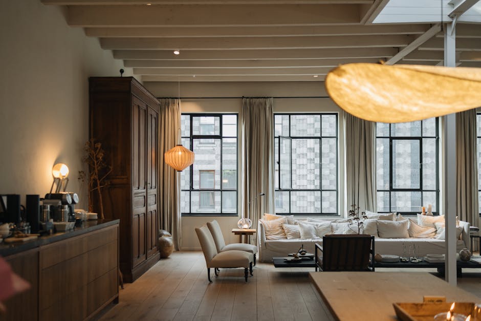
The Enduring Power of a Thoughtful Palette
In the dynamic world of interior design, trends come and go, but certain approaches stand the test of time. Central to creating spaces with lasting appeal is the 'palette-first' philosophy—a commitment to defining the overarching color and material scheme before any other design decision. This foundational step ensures cohesion, mood, and a sense of permanence. Few exemplify this mastery better than Studio Piet Boon, whose work consistently showcases how a meticulously developed palette can elevate an interior from merely stylish to truly timeless.
Studio Piet Boon's Philosophy: Beyond Fleeting Trends
Studio Piet Boon, in collaboration with partners like FORMANI, has cultivated a 'beloved palette' by deeply understanding the evolution of color and material use in design. Their approach, as articulated by Jesseca van Haneghem, a senior specialist at the studio, isn't about chasing the latest fads but about setting trends through thoughtful, sustainable choices. They view 'finishes' as a vital part of product development, ensuring that every element, from architectural hardware to large surfaces, contributes to a unified aesthetic.
Their palette is characterized by a sophisticated blend: traditional steel shades, rich dark tones like black and bronze, crisp whites, and warm, earthy hues such as gold and copper. This careful selection allows for versatility while maintaining a signature understated luxury. The goal is to create residential interiors that prioritize calm, comfort, and long-term relevance, reflecting the personal taste of the inhabitants rather than a passing style.
Building the Palette: Earth, Metal, and Light
The Studio Piet Boon aesthetic is built upon a foundation of natural and refined elements. Imagine a space where the walls embrace 'airy neutrals'—taupe, ivory, white, beige, and soft sage. These colors, often described as warm minimalism, create a cozy, storied atmosphere, acting as high-performance workhorses that unify the home. They provide a serene backdrop, allowing other elements to emerge without overwhelming the senses.
Against this neutral canvas, dark palettes find their sophisticated expression. Deep blues, rich browns, and velvety blacks, often seen in contemporary luxury settings, convey elegance and exclusivity. These aren't used for drama alone but to ground the space, adding depth and a sense of gravitas. Architectural hardware, often in dark bronze or black, becomes a subtle yet powerful accent, reinforcing the palette's integrity.
The Role of Materiality: Texture as a Design Language
For Studio Piet Boon, color is inextricably linked with material. It's not just the hue but how that hue interacts with texture and light. Layering texture-rich materials is crucial. Think of linen, wool, and jute textiles that add tactile warmth and visual interest, preventing neutral schemes from feeling stark. Dark wood paneling, reminiscent of traditional Japanese or Art Deco interiors, introduces a natural richness and a sense of permanence.
Polished metals, dark marble, and even charred cedar (shou sugi ban) are integrated to enhance the luxurious feel. These materials, with their inherent qualities, contribute to the overall 'finish' of a space, creating a multi-sensory experience. The interplay of matte and polished, rough and smooth, is as important as the color itself, adding layers of sophistication that define the Piet Boon signature.
Case Study: The Urban Sanctuary Residence
Consider a hypothetical 'Urban Sanctuary' residence designed with this philosophy. Upon entering, one is enveloped by a sense of calm. Walls are painted in a soft, warm taupe, reflecting natural light gently. The flooring is wide-plank, light oak, providing a continuous, grounding surface. In the living area, a large, inviting sofa upholstered in a textured, off-white linen anchors the space. Cushions in muted sage and a deep, charcoal gray add subtle color variation.
Architectural hardware throughout, from door handles to window frames, is rendered in a dark bronze finish, providing a sophisticated contrast to the light walls. A custom-built media console, crafted from dark, fumed oak, features integrated storage, its clean lines emphasizing modern minimalism. A large, abstract artwork above the sofa incorporates warm browns and muted golds, tying into the overall palette. Moody lighting, achieved through strategically placed recessed fixtures and a sculptural floor lamp with a dark metal base, enhances the luxurious feel, creating intimate zones within the open-plan layout. This careful orchestration of 'airy neutrals,' dark metals, and natural textures creates an environment that feels both contemporary and deeply rooted, a true sanctuary from urban life. It's a space that doesn't shout for attention but rather invites quiet contemplation and enduring comfort.
Achieving Timelessness Through Thoughtful Integration
The success of Studio Piet Boon's approach lies in its holistic integration. By starting with a 'palette-first' mindset and meticulously selecting finishes and materials that complement each other, they create spaces that transcend fleeting trends. Their designs prioritize long-term relevance and emotional resonance, proving that a thoughtful, integrated color and material palette is the cornerstone of truly timeless interior design. It's a testament to the power of a grounded aesthetic, where every element contributes to a cohesive, enduring vision.
Further reading
Related articles
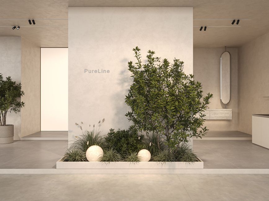
Microcement: The Seamless Canvas for Modern Home Renovations
In the dynamic landscape of home renovations, microcement stands out as a material offering unparalleled design flexibility and a sleek, modern aesthetic. This deep dive explores its properties, diverse applications, and crucial trade-offs, positioning it as a key consideration for designers aiming for cohesive, high-impact transformations.

The Enduring Appeal of Thermal Bluestone in Luxury Outdoor Design
Discover why thermal bluestone is the material of choice for high-end outdoor environments. This deep dive explores its unique properties, diverse applications, and the trade-offs that make it a cornerstone of luxury landscape design.