The Return of Bold Colour: Why Color Drenching Is Replacing the Neutral Palette
A decade of greige minimalism is giving way to confident, saturated colour, and the technique driving it, color drenching, treats hue as a structural decision rather than an afterthought.

The end of the neutral decade
For much of the last ten years, the safest decision in a residential interior was also the quietest one: greige walls, white trim, a palette engineered to disappear into real-estate photography and resale value alike. That era is ending, and the shift shows up first in how designers talk about colour — not as decoration applied after the plan is finished, but as a structural decision made alongside the floor plan itself.
What color drenching actually means
The technique driving this shift has a name now: color drenching. Rather than a single accent wall against three neutral ones, drenching applies one saturated hue across every surface in a room — walls, trim, doors, and often the ceiling, sometimes even the baseboards and window frames. The effect eliminates the visual seams that trim colour usually creates, so even a small room reads as one continuous volume of colour rather than a box with a coloured stripe on it.
Designers have started calling the ceiling the fifth wall precisely because drenching treats it as equally deliberate — a moody navy or deep plum ceiling isn't an afterthought anymore, it's often where the colour decision starts.
The palette: confident, not primary
What's notable about the current wave isn't just saturation, it's specificity. The colours gaining ground aren't the primary red-and-blue boldness of past maximalist cycles — they're layered, slightly muted tones with real depth: merlot and oxblood reds, deep plum, forest green, moody navy, warm charcoal. These read as sophisticated rather than playful, which is precisely why they work in rooms that need to feel considered rather than decorated.
Chartreuse is the outlier worth naming — an acidic yellow-green that has shown up repeatedly in 2026 forecasts as a deliberate break from the sage-and-olive greens that dominated for years. It is a genuinely different colour family, and its appearance signals that safe green is no longer automatically synonymous with on-trend green.
Why now
Two forces are converging. The first is simple fatigue: a decade of near-identical neutral interiors has made restraint feel less like taste and more like an absence of decision, and clients increasingly ask for spaces that feel specific to them rather than resaleable to anyone. The second is more structural — a fully colour-drenched room photographs with a coherence an accent wall never achieves. In a market where a project's first audience is often a phone screen before a person standing in the room, one saturated volume of colour reads instantly and consistently across formats in a way a neutral base with scattered accents does not.
Where it works in the plan
Kitchens and bathrooms have turned out to be unexpectedly strong candidates for drenching, precisely because they're already bounded, already have a defined function, and rarely need to negotiate sightlines with an adjoining open-plan space. A powder room fully drenched in ink-black or deep plum reads as a deliberate jewel-box moment rather than a compromise; a kitchen drenched in forest green against unlacquered brass hardware turns cabinetry that would otherwise be the largest neutral surface in the home into the room's actual subject.
How to use it without regret
The risk with drenching is obvious: a wrong colour choice is now the whole room, not one wall of it. Designers using the technique well follow a few consistent disciplines. First, they test at full scale and in the room's real light before committing — a saturated hue behaves completely differently under morning light than under evening lamplight, far more dramatically than a pale neutral does. Second, they reserve the technique for rooms with a clear identity and defined use rather than open-plan spaces that need to read calmly from multiple angles at once. Third, and most consistently, they pair the saturated colour with warm metals — aged brass, bronze, unlacquered brass — and dark, grained wood rather than the cool chrome and pale oak that dominated the neutral decade; the warmth in the materials keeps a deeply saturated room from tipping into something cold or theatrical.
For architects and designers coming out of a decade of restraint, the return of confident colour isn't a rejection of the discipline neutral design demanded — it's the same discipline, redirected. A colour-drenched room still has to be planned, tested, and resolved as carefully as any neutral one. It simply no longer hides the decision.
Related articles
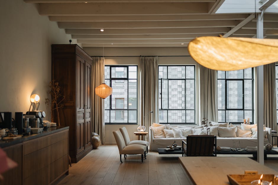
The Grounded Palette: Crafting Timeless Interiors with Studio Piet Boon's Material Philosophy
Explore how Studio Piet Boon masterfully integrates a 'palette-first' approach, combining natural materials and sophisticated finishes to create interiors that exude timeless elegance and emotional depth. This case study delves into their philosophy of enduring design.

The Tactile Palette: Elevating Color Through Materiality and Light
Moving beyond paint chips, this article explores how the inherent properties of materials—their texture, sheen, and response to light—are fundamental to crafting a truly impactful and sensory-rich color palette in interior design.